The following is a blog post from MA Digital Culture & Society student and Chevening scholar Sachini Perera (bio below), drawing on work that she has been doing as part of the “Digital Methods for Internet Studies” module.
Bit of background
I’m currently a 2019/2020 Chevening scholar reading for a Masters in Digital Culture and Society at King’s College London. I’ve been learning interesting methodologies, especially on visual inquiry, in a module I’m following on Digital Methods for Internet Studies. Given the increased use of Instagram during the recently concluded Presidential election of Sri Lanka, I thought it’ll be interesting to apply a visual inquiry to Instagram posts containing the main hashtag #PresPollSL (as well as the misspelt but frequently used #PressPollSL) to better understand some of the visual language of the campaigns. A disclaimer that I’m new to this method and am sharing some surface level observations but would be happy to share the dataset with others who want to dive deeper.
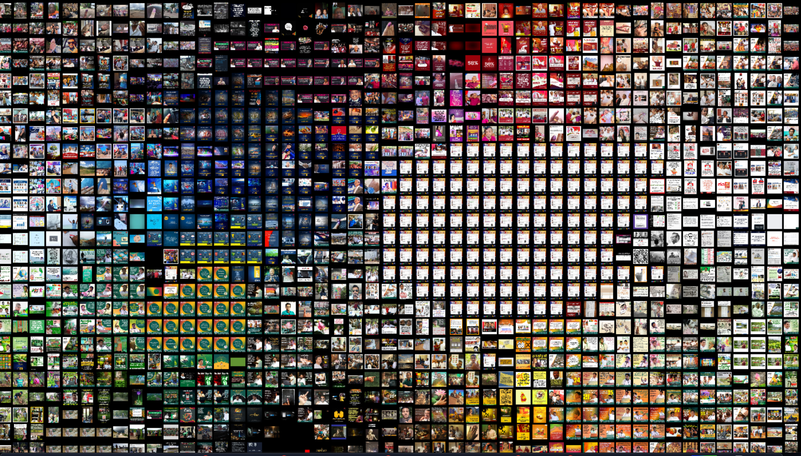
The approach I used is closest to ‘Color similarity image grid’. This was shared with us by Gabriele Colombo during a guest lecture. Check him out. His work is fascinating, particularly this inquiry into images of riot pornography.
This approach helps identify patterns of repetition in one image set. By using a tool to organize the folder of images in a grid that sorts them by color, name, size or date of publication, you can identify similar images or themes, variations of the same image, notice similar objects, etc. While I might zoom in on a few individual images in the analysis below, I’m more interested in viewing and understanding the images as a group. Gabriele explains this further in ‘Studying digital images in groups: the folder of images‘.
Tools used
- Instagram Scraper
- Google Sheets
- Tab Save Chrome extension
- ImageSorter
Limitations and Challenges
One of the things I enjoy the most about this module is that it enables us to critically evaluate not just how society and culture is shaped or influenced by digital devices, methods and data, but also to reflect on:
- the inherent limitations, restrictions and biases of the platforms we use for internet research;
- the limitations of the tools and datasets in digital methods (and as a result, the findings); and
- ethical concerns around using digital objects for research purposes (ex- contextual privacy of users, as explored by Helen Nissenbaum).
All of which is to say, please consider these as you scroll through the observations I’ve made. Some of the limitations and challenges I encountered during this exercise include:
- a recurring 500 error on Instagram Scraper that could result in some images being missing;
- the Instagram Scraper only scrapes posts and Instagram stories, pinned stories or IGTV content are not included in the scrape;
- lack of time to scrape more hashtags that are relevant to the election as I’m doing this during a busy time; and
- using images from public but personal accounts with the ethical concern that while the users have included the hashtag in their posts to increase visibility within Instagram, they may not have consented to the images being scraped and analysed elsewhere.
This last point is one I often struggle with because it is never clear how much informed consent users give (or can give) when they create digital objects that they share publicly. With this in mind, I’m not sharing a link to the dataset here but as mentioned earlier, please reach out if you’re interested in playing with the dataset.
Some observations

The campaign and party colours of main candidates can be clearly seen in the clusters of blue, green and shades of magenta/red. There’s a smaller cluster of yellow and orange and a rather large group of identical white images.
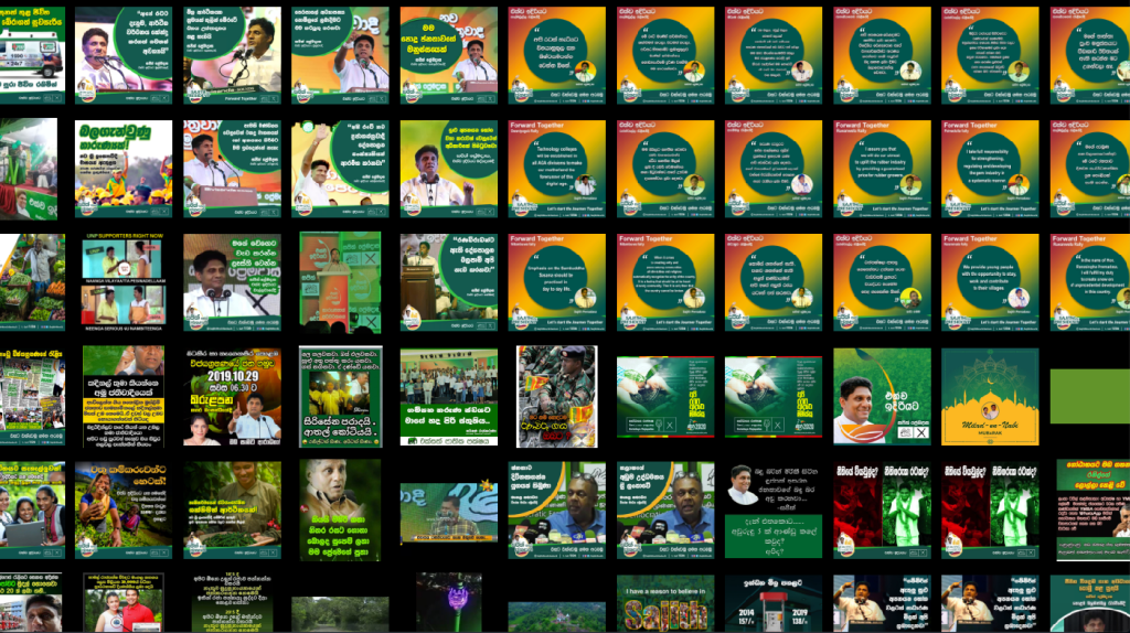
A closer look at the cluster of green shows that as expected, most of the images are from Sajith Premadasa’s campaign, featuring images of him, political allies, as well as what seems like stock images in campaign posters. It is worth noting that these are predominantly in Sinhala language followed by English. None in Tamil as far as I can tell.

While there is visual consistency in the posters that quote Sajith, the different elements are a bit clumsy. The campaign logo is not trilingual and therefore is changed according to language. His face appears twice in what is a very small poster. There is no marked difference in the posters that are quoting his political allies (yeah, I also missed that one at first). The posters are also too wordy for current consumption patterns and details such as where he made the statement could have been easily omitted.

While a uniform base template is used in the campaign posters, there is no consistency in the text fonts and colours and I just noticed the floating foreheads in the first image! And once again, these are entirely in Sinhala. Most posters featured women and while not pandering is a refreshing change, it is worth noting that Sajith’s posters don’t show him interacting with his voter base.
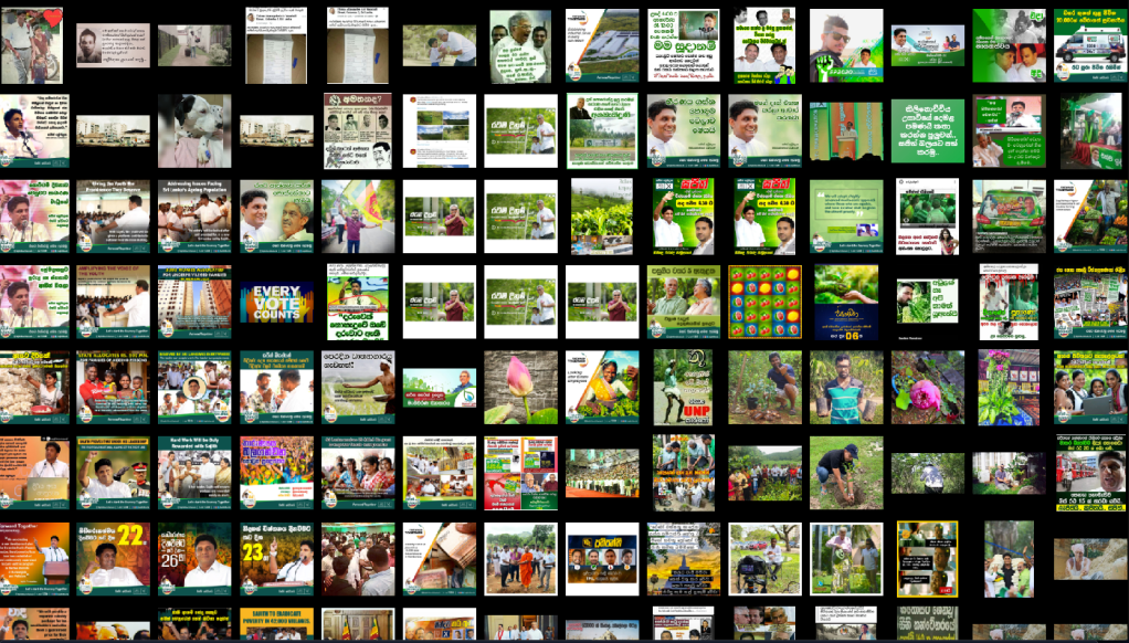
A bit more exploration in the green cluster shows that there are many images from Gotabaya Rajapaksa’s campaign. Specifically linked to the hashtag #නිදහසේහුස්ම and the claim that it is the first ever carbon neutral Presidential campaign in the world. The green cluster also includes memes created and/or shared by those who oppose Sajith.

The point of convergence between those two groups of images seems to be the one at the bottom left that compares the tree planting techniques of the two candidates and criticizes Sajith for not kneeling. I should also add that lotus buds (Gotabaya’s symbol) are a recurring image in the folder, including photos of children holding them.

This “how many people and ethnicities does it take to plant a tree?” photo seems like a good closing to the tree planting segment.

The blue cluster is dominated by posters for Gotabaya Rajapaksa and posters by the Viyathmaga (Professionals for a Better Future) campaign/group. The above screenshot is a great example of the visual relationship between the two groups of images while maintaining just enough distance to make Viyathmaga seem nonpartisan.
Another batch of Gotabaya’s campaign posters contrast quite sharply against Sajith’s posters. These are sleekly designed with the predominant themes of military and development (no surprises, just confirmations). Most of his posters don’t say much but in those that do, such as the one with the yellow bus, the campaign promise is signed off with Gotabaya’s signature, a small but significant detail.
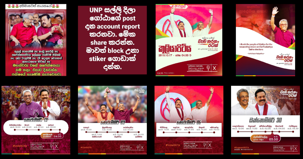
The red cluster is also mostly Gotabaya by which I mean mostly Mahinda because as noted by many people during this campaign, it was Mahinda who was the face of the campaign. Most images show Mahinda slightly in the background but then there’s also this (see below).

Also worth noting that a number of memes in support of Gotabaya also followed the red and magenta colour schemes.


In contrast to Gotabaya, Sajith was not highlighting his lineage and family much on Instagram (I’m not sure how that compares to other platforms) and one of the few instances is this #throwback photo to when his father submitted his Presidential nomination (left). However R. Premadasa’s face does appear multiple times in the folder of images in various memes made by Sajith’s opponents.
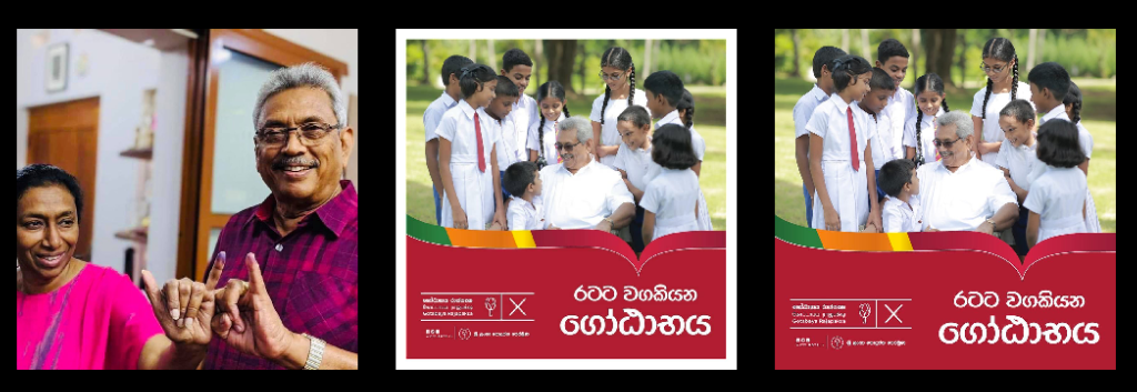
Mahinda’s playbook is well used by Gotabaya as illustrated by the number of posed and candid photos with children, older women and with family. And as with many other posts, his supporters were doing the job for him, making images like the baby with a picture of Gotabaya go viral.

The white cluster is images of election results from Hiru News and Hiru Gossip. When the image folder is arranged by date, it shows that these were the only posts consistently sharing election results though it is possible that these were being shared on Instagram stories that are not captured by this dataset.
One thing to observe about these election result graphics is that they are not using any visual elements to illustrate the number of votes received by candidates. Hansi Munasinghe discusses this much better than I can so read her Twitter thread if you’re interested in data visualization.
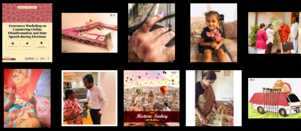
And finally, while only a few photos of the post-voting inked fingers come under this dataset (#iVotedSL being the more popular choice for this as well as Instagram stories), this final image seems like a great way to wrap up this post and this election.

Sachini Perera is a queer feminist activist from Sri Lanka. Her work is located at the intersection of the internet, popular culture, sexuality and gender, freedom of expression, and policymaking. Sachini is currently a 2019/2020 Chevening scholar and is reading for an MA in Digital Culture and Society at King’s College London. She has worked in strategic communications and advocacy for feminist and women’s rights organizations for the past decade. In 2017 she set up Ghosha (meaning loud, noisy, outspoken), a feminist initiative in Sri Lanka that aims to support women and queer people from Sri Lanka to use the internet in free, rights-based, affirmative and pleasurable ways. Sachini is also a member of RESURJ, a transnational alliance of younger feminists from the global south working on sexual and reproductive justice. This post is cross-posted from her blog.